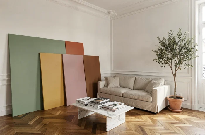
The color palettes offered by paint manufacturers for living rooms evolve under the combined effects of decorative trends and less visible regulatory constraints. The CLP regulation requires manufacturers to revise the formulation of certain pigment mixtures by May 2026, which subtly alters the available offerings on the shelves.
At the same time, emission labeling (classes A+ to C, mandatory in France since 2013) directs choices towards ranges with low volatile organic compounds. Here are ten specific colors to repaint your living room while considering these realities.
1. Sage Green on a Single Accent Wall
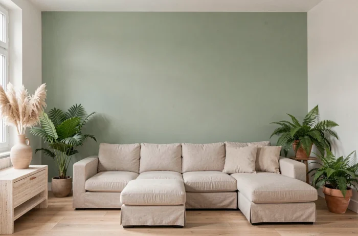
Sage green’s popularity stems from its ability to work well in both cool natural light and warm artificial lighting. Applied to a single accent wall, it structures the space without closing off the room.
When searching for paint ideas for living rooms, this shade consistently appears in natural palettes. Its strength lies in its vegetal neutrality: it pairs well with light wood, rattan, and black metal without chromatic conflict.
Be cautious of the undertone. A sage green that is too gray may appear dull in a north-facing living room. Opt for a slightly yellowed version if light is lacking.
2. Off-White Formulated in A+ Emission Class
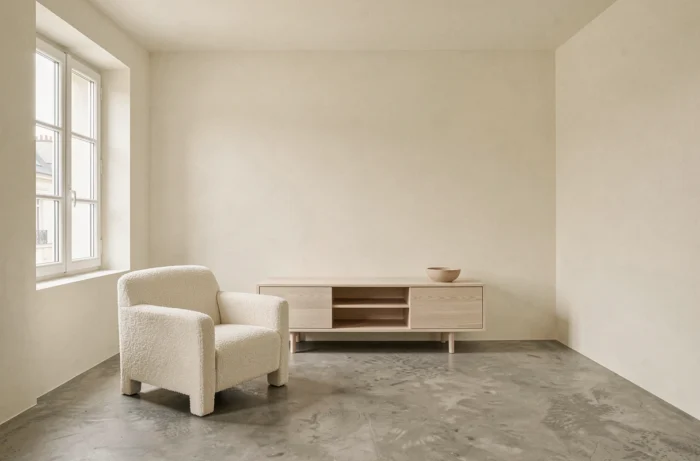
White remains the predominant choice for French living rooms, but not all whites are created equal. A+ rated paints for indoor air emissions ensure a minimal VOC level after application, a criterion often overlooked in decor articles.
An off-white (leaning towards linen or eggshell) avoids the clinical effect of pure white. It visually enlarges the room while creating a softer atmosphere than optical white.
A common mistake: choosing a white in-store under neon lights, only to discover it turns yellow or blue at home. Always test a sample on the wall in question, observing the result at three different times of the day.
3. Terracotta on the Lower Wall for a Warm Living Room
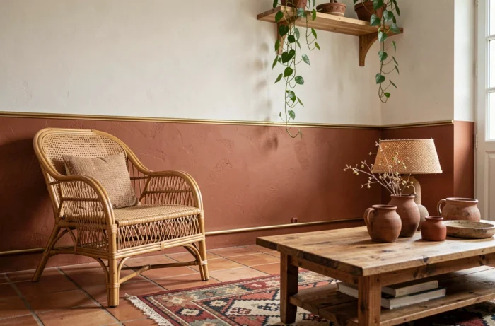
Terracotta is not limited to an accent wall. Painted on the lower third of the wall, it brings a Mediterranean warmth without overwhelming the volume. The upper third remains in a light shade, preserving the ceiling height.
This lower wall technique is particularly suitable for living rooms with high baseboards or existing woodwork. The boundary between the two shades can be sharp or highlighted by a molding.
Terracotta does not work well in rooms already saturated with dark wood. However, when paired with light oak furniture or gold metal, it gains sophistication.
4. Stormy Blue for a Library Wall
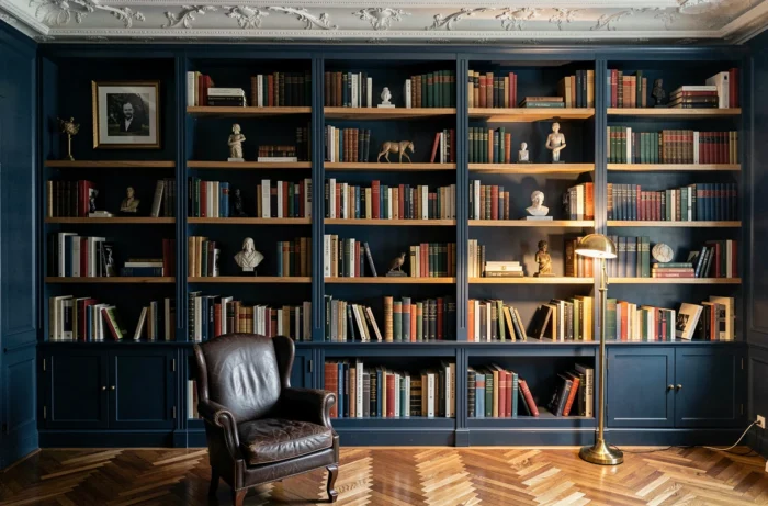
A deep blue, almost slate, transforms a storage wall into an architectural feature. The colorful spines of the books stand out against this dark background, adding visual depth to the room.
This type of saturated color requires a matte or velvety finish. Satin would accentuate the imperfections of the surface and create unwanted reflections. Plan for at least two coats on a prepared white base.
Stormy blue absorbs light: it is suitable for living rooms with at least one large opening. In a dark room, it can create an oppressive atmosphere.
5. Golden Ochre in Matte Finish
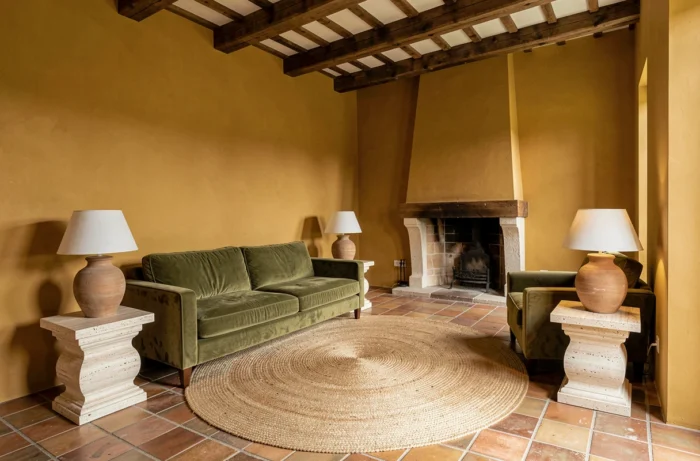
Ochre is making a comeback in the 2026 palettes driven by the trend of warm transatlantic colors. More assertive than beige, less aggressive than mustard yellow, golden ochre warms a living room without overwhelming it.
In a matte finish, it absorbs light evenly and masks small imperfections in the wall. It is a pragmatic choice for older homes where walls are not perfectly smooth.
6. Powder Pink on the Fireplace or a Nook
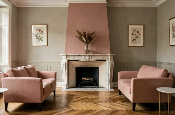
Powder pink works best on a defined surface: niche, fireplace trumeau, alcove framing. When applied to all four walls, it quickly saturates.
Its strength: it pairs well with anthracite gray, olive green, and brass. It brings a softness without being cloying when used on a small surface.
Check the undertone before purchase. A too-cool pink (leaning towards mauve) can create a mismatch with warm wood furniture.
7. Sand Beige for a Versatile Background
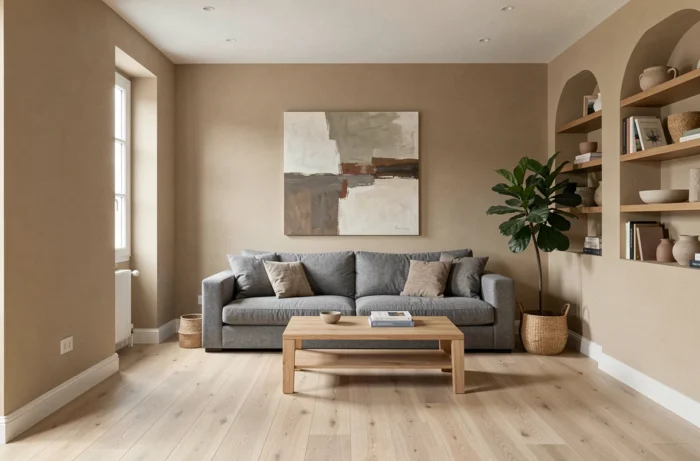
Sand beige is the least risky color in this selection. It works in all orientations, with all styles of furniture, and never goes out of style.
Its drawback: it can lack character if not enhanced by contrasting elements. Here are some pairing ideas:
- Cushions and curtains in forest green or petrol blue to create a textile focal point
- A black metal frame or shelf to structure the view
- A geometric patterned rug to break the monotony of the neutral background
8. Forest Green in Total Look on All Four Walls
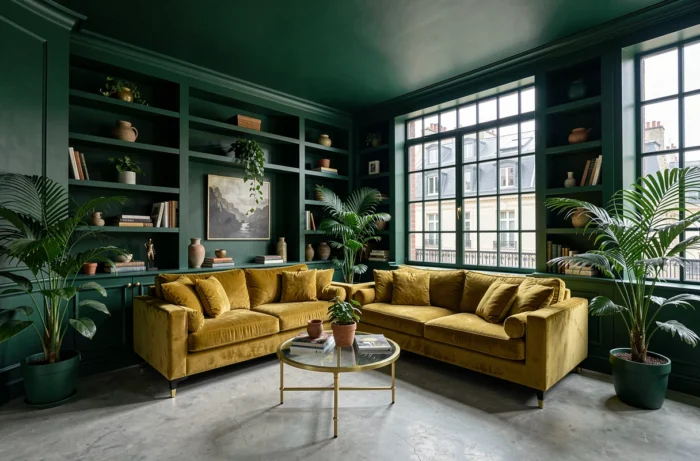
Unlike sage green, forest green fully embraces its depth. Painted on all walls, it creates a cocooning effect, provided the ceiling remains white or very light.
This total look works in medium to large living rooms. In a small space, it risks visually compressing the room. Indirect lighting (wall sconces, floor lamps directed towards the ceiling) compensates for light absorption.
9. Anthracite Gray in Satin Lacquer
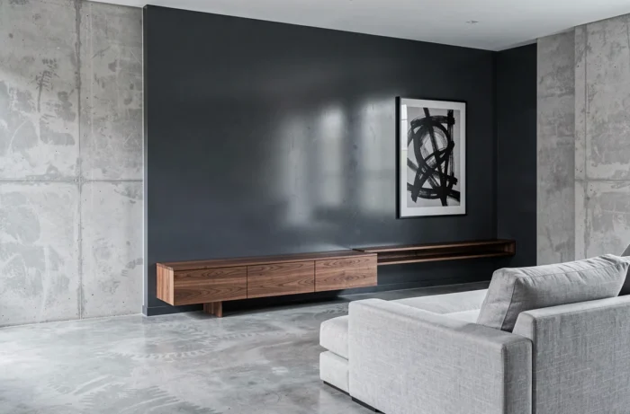
Anthracite gray in a lacquered finish produces a partial mirror effect that enlarges the space and reflects light sources. It is a suitable choice for contemporary living rooms with few furnishings.
The downside: satin lacquer reveals every imperfection of the surface. Preparing the wall (smoothing compound, sanding, primer) often requires more work than the painting itself. Here are some points to anticipate:
- A smoothing compound over the entire surface if the wall has irregularities
- A specific primer for lacquer, different from a standard primer
- A longer drying time between coats than with matte paint
10. Amber Honey for a Bright Atmosphere All Year Round
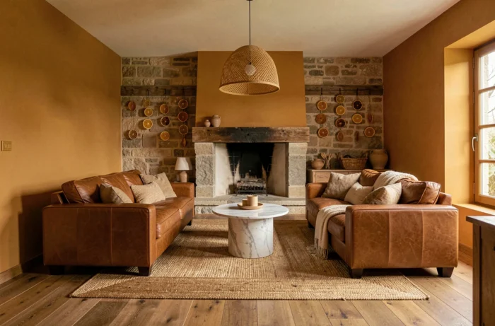
Amber honey captures and redistributes natural light, even on overcast days. It is a color that compensates for the lack of brightness in north or east-facing living rooms.
It naturally pairs with raw materials: crumpled linen, artisanal ceramics, oiled wood. Avoid combining it with glossy white furniture, which creates too harsh a contrast.
The trend of warm tones for 2026, particularly driven by transatlantic palettes, places amber honey among the most sought-after shades in DIY superstores. Its versatility makes it a safe choice for a first painting project in the living room.
The choice of a paint color for the living room depends as much on the room’s orientation and the quality of the surface as on the color itself. Before deciding, check the emission class on the can and test a sample directly on your wall, in both natural and artificial light. A good color choice is primarily one that is suitable for your actual space.